
☕️ Busy? Here's the TL;DR
- To maximize readability, run through an equity checklist
- Check for clarity: headers, bullets, alt text, clear subject lines
- Check for translatability: show how to & add translatable copy for flyers
- Check for mobility: test its readability on mobile & post it everywhere.
- Check for connectivity: create a sense of the personal & add contact info
Why send a classroom newsletter if all your intended readers can't access it?
That's why a simple check for equity is valuable. Think of it like a pre-flight checklist. You wouldn't want a pilot to skimp on that, would you?

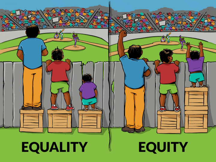
As a reminder, the difference between equity and equality is like the difference between a building with a ramp and a building without one. Without a ramp, everyone has the same door to enter, but for some, reaching that door poses real challenges. The ramp means folks with mobility challenges can enter the building as easily as folks without.
Here's a visual:
First up on the equity checklist: clarity.
As you scan your update for clarity, here's what you should look for:
1. Headers ✅
2. Bullets & numbered lists ✅
3. Alt text with every image ✅
4. Subject line guideposts ✅
#4 means writing subject lines that alert readers to important items inside the update. For example, "Need to Know Info for Monday's Field Trip" vs. "4th Grade News." If you want to learn more about this, check out our blog post on writing great subject lines.
Next up: translatability.
Beyond the question of whether or not your school newsletter is translatable, do you:
- Include directions for how to access the translation tool?
- Include explanatory text along with flyers, since those aren't translatable?
If there are segments of your class newsletter that don't translate, only some of the information is making it home.
The third box to check is mobility.
Is your update:
- Posted everywhere your readers are?
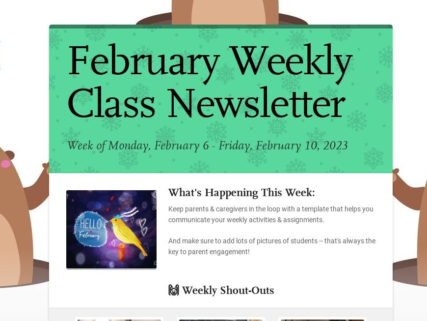
- Easy to read on mobile? It is? How do you know? Did you send yourself a test email and read it on your phone? Go ahead and try it! If you see long blocks of text, I guarantee you it's not easy to read on mobile... Just look at this example 👇🏽
Did you know 85% of folks access email on their cell phones? The fact is, if you're not explicitly writing for that (palm-sized) medium, you're putting blockers in your readers' way.
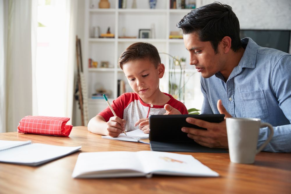
The 4th box to check is connectivity.
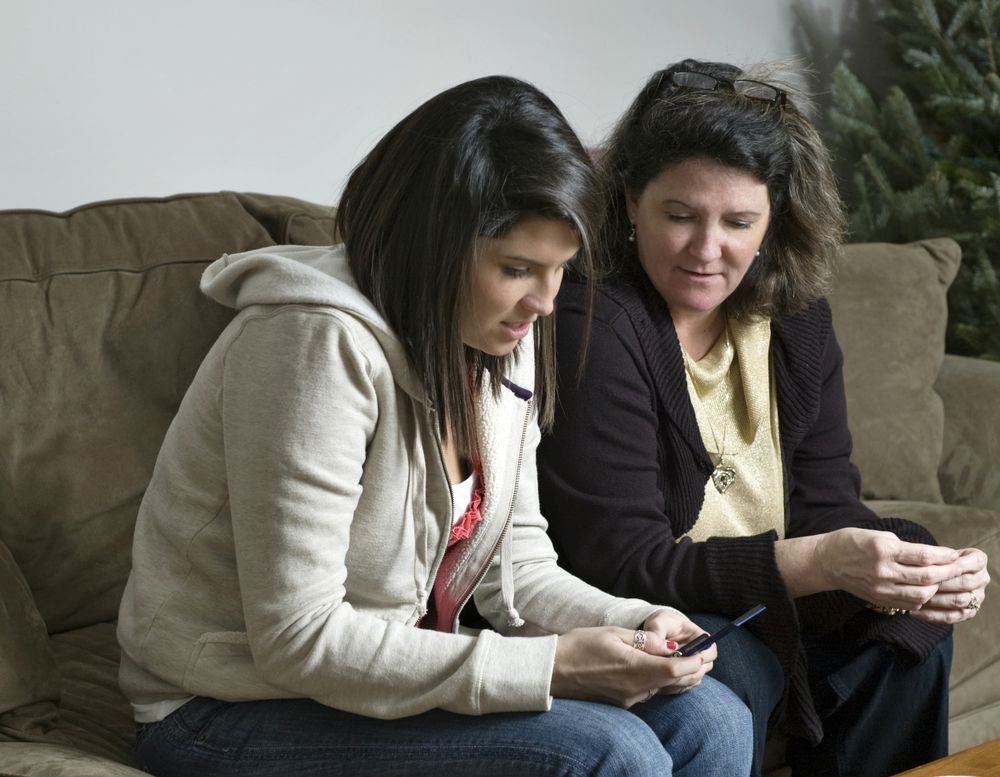
This one is a little more subjective. It asks you to question if you're creating a sense of the personal in your classroom newsletter. Ask yourself: "What in my update gives families the idea I know & care for my students?" Ask yourself: "In what ways do I bring families into my classroom?"And a final, more concrete question: do you offer your readers multiple options for how to connect with you?
If you checked all the boxes, way to go! Need a template? Get started here 👇🏽
Subscribe to Smore Blog
Get the latest posts delivered right to your inbox